Hyva UI Components Demo Store - Evolutionize Your Magento Frontend
UI Component: Banner.A - single
Hit the court in style.
UI Component: Banner.B - split
Hit the court in style.
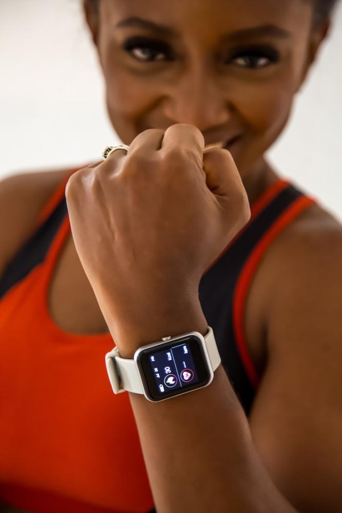
UI Component: Banner.C - grid-2
Hit the court in style.
Tread lightly.
UI Component: Categories.A - grid - images
Shop by category
Browse all →
UI Component: Categories.B - grid - patterns
Shop by category
Browse all →
UI Component: Categories slider
Shop by category
Browse all →
UI Component: Accordion.A - basic
What is Hyvä UI?
Hyvä UI is a paid component library for Hyvä Theme. It gives you ready-made storefront blocks you can reuse across pages to speed up frontend delivery and keep UI consistent.
Is Hyvä Theme free now? Is Hyvä UI free too?
Hyvä Theme is now free and open source. Hyvä UI is a separate paid add-on product (€250) with its own license.
What can I see on this demo store?
Real storefront examples of Hyvä UI components such as banners, accordions/FAQ, navigation patterns, content blocks, and reusable UI patterns you can apply to a Magento storefront.
Do these components work out of the box?
They’re built for Hyvä Theme as reusable components. You still need implementation in your project (copy/adapt, connect to content/data, align styling), but the baseline structure and interactions are ready.
Can the components be customized to my brand?
Yes. You can restyle them with Tailwind, adjust templates, and tailor behaviour where needed, while keeping a consistent UI system across your storefront.
Does Hyvä UI replace a custom design?
No. It accelerates delivery by providing a strong base for common blocks. You can still apply your own design system and UX, Hyvä UI simply reduces repetitive work.
Where can I learn more?
Official Hyvä UI info: https://www.hyva.io/hyva-ui.html
Read about this demo store: https://eltrino.com/blog/hyva-ui-components-demo-store
UI Component: CTA.A - image
Excuses don’t burn calories
Make sure each work-out is better than the last with our ProFit collection.
UI Component: CTA.B - text only
Build faster with Hyvä UI Components
Explore ready-made storefront blocks, keep your UI consistent, and speed up Magento delivery with a reusable component library.
UI Component: CTA.C - split
Excuses don’t burn calories
Make sure each work-out is better than the last with our ProFit collection.
UI Component: Testimonial.B - card
“
Lorem ipsum dolor sit amet, consectetur adipiscing elit. Curabitur eu neque aliquam metus porta
sagittis. Nunc velit ligula, vestibulum et neque et, ullamcorper convallis.
Laura Peterson
Awesome Company
UI Component: Testimonial.A - simple
“
Lorem ipsum dolor sit amet, consectetur adipiscing elit. Curabitur eu neque aliquam metus porta sagittis.
Nunc velit ligula, vestibulum et neque et, ullamcorper convallis.
Laura Peterson
Awesome Company
UI Component: Shortcuts simple
My account
Track your order, view and create wishlists or return items.
Support
Check out the FAQ or get in touch with us for assistance.
Newsletter
Be the first to know about new arrivals and our best offers.
UI Component: USP.A - icons
Why Hyvä UI Components?
Here’s why.
Faster storefront delivery
Start from ready-made storefront blocks instead of building common UI patterns from scratch. Ideal
for MVPs, redesigns, and rolling out new pages faster.
Consistent UI across the store
Components follow a shared design system, so category pages, product pages, and CMS content look and
behave consistently across the storefront.
Less custom code to maintain
Reuse proven components and focus development on what’s unique to your business—often meaning fewer
bugs, easier upgrades, and lower long-term maintenance.
Better design-to-dev collaboration
A component-based approach helps teams align faster on reusable blocks, reducing design-to-code
mismatch and speeding up QA.
UI Component: USP.B - cards
Why Hyvä UI Components?
Here’s why.
Built for real storefront needs
Hyvä UI focuses on everyday building blocks merchants actually use navigation patterns, banners,
accordions, and content components, so the foundation is solid from day one.
Easier estimation & delivery
When common components are ready, teams can estimate work more accurately and deliver faster without
reinventing the same UI elements for every new page.
Consistency across teams
A shared component library reduces “everyone builds it differently.” That means fewer UI
inconsistencies and smoother collaboration between designers, frontend, and QA.
Preview before you implement
Use this demo store to evaluate the UX, spacing, and component behaviour in a real storefront then
decide which blocks fit your roadmap before development starts.
UI Component: USP.C - compact
Production-ready UI blocks
Use proven storefront patterns for common needs like banners, navigation, accordions, and content
blocks, so you don’t rebuild the basics on every project.
Faster time-to-market
Start from ready-made components and adapt them to your brand. This shortens build time and helps
teams ship new pages and features sooner.
Consistent UX at scale
Keep UI consistent across PLP, PDP, and CMS content especially useful for multi-language and
multi-store setups where consistency is hard to maintain.